|
|
Post by marchingband1969 on Jan 12, 2018 15:59:35 GMT -5
Changing logos is expensive and confusing to your audience. And since we just went through this change several years ago, I think we should hold off for now.
What we do need is more people working in sports marketing and athletic fundraising. And not just addition bodies but professionals that have proven expertise and track records.
|
|
Maxell
Official BDF member
Director of BDF Marketing
Posts: 12,431
Member is Online
|
Post by Maxell on Jan 12, 2018 16:04:41 GMT -5
I think "The Lock" should stay and the bulldog without arms looks good. 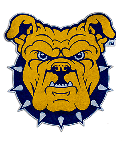 But I like the Samford logo presence. Bottom line is lose the logo with the arms in every style guide. Take it off the front of the Aggie Stadium for sure!I agree Maxell. I like the bulldog without the arms. But I think we should also incorporate the interlocking A&T on the collar similar to how UGA has the G on their dog collar: www.underconsideration.com/brandnew/archives/one_dog_to_rule_them_all.php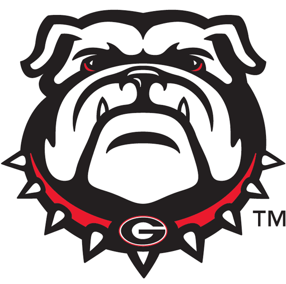 |
|
Maxell
Official BDF member
Director of BDF Marketing
Posts: 12,431
Member is Online
|
Post by Maxell on Jan 12, 2018 16:11:10 GMT -5
Just for fun!
|
|
|
|
Post by Bornthrilla on Jan 12, 2018 16:19:21 GMT -5
Changing logos is expensive and confusing to your audience. And since we just went through this change several years ago, I think we should hold off for now. What we do need is more people working in sports marketing and athletic fundraising. And not just addition bodies but professionals that have proven expertise and track records. I couldn't disagree with you more. At the very least revamping your logo will result in a instant and very significant increase in merchandise sales. All your fans will have a reason to run out and get the newest gear. www.bizjournals.com/charlotte/blog/queen_city_agenda/2014/01/charlotte-bobcats-execs-happyto-see-hornets-gear.htmlIf done right it will also improve the overall brand strength of your athletic department and university. Improved brand assests result in increased visibility for your school and more effective marketing. Plus you can always keep the previous logos as legacy/throwback items and still sell those. Just look at NC State. They are currently getting traction out of both their new and old logo: 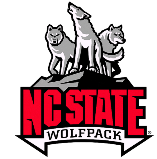 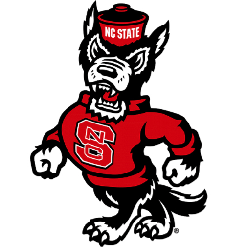 . It is literally a win-win. |
|
Maxell
Official BDF member
Director of BDF Marketing
Posts: 12,431
Member is Online
|
Post by Maxell on Jan 12, 2018 16:42:36 GMT -5
|
|
|
|
Post by DOOMS on Jan 12, 2018 18:45:56 GMT -5
You mean kinda like this:  I’m quite partial to this one. The yellow dog makes me wanna vomit. Dog shouldn’t be yellow. Should be brown with a blue and gold collar. |
|
Deleted
Deleted Member
Posts: 0
|
Post by Deleted on Jan 12, 2018 19:32:02 GMT -5
I guess this is better than the green grass debate.
Sometimes, I really feel you all need something complain about. Sheesh.
|
|
|
|
Post by Bornthrilla on Jan 12, 2018 19:33:17 GMT -5
One thing about logos is you typically want to have the official colors reduced to a minimum, due to reproduction considerations.
For instance, if you design a t-shirt, every different color on the logo would require a separate setup screen which carries an additional charge.
So every time you would reproduced your new logo it would require at least 4 colors: blue, gold, brown and a outline color like black or white to separate the blue and gold from the brown. (Brown is not a color that normally plays nice with others)
|
|
|
|
Post by Bornthrilla on Jan 12, 2018 19:38:05 GMT -5
Westcoast, one day I am going to take you out to lunch and explain the concept of strategic planning.
|
|
|
|
Post by Bornthrilla on Jan 12, 2018 19:51:55 GMT -5
|
|
|
|
Post by Aggie Monster on Jan 12, 2018 21:46:35 GMT -5
The logo is fine. I dont like the arms, but its displayed without the arms all the time.
|
|
Maxell
Official BDF member
Director of BDF Marketing
Posts: 12,431
Member is Online
|
Post by Maxell on Jan 12, 2018 23:55:40 GMT -5
The logo is fine. I dont like the arms, but its displayed without the arms all the time. How about your avatar as the logo?!? |
|
|
|
Post by DOOMS on Jan 13, 2018 8:35:53 GMT -5
One thing about logos is you typically want to have the official colors reduced to a minimum, due to reproduction considerations. For instance, if you design a t-shirt, every different color on the logo would require a separate setup screen which carries an additional charge. So every time you would reproduced your new logo it would require at least 4 colors: blue, gold, brown and a outline color like black or white to separate the blue and gold from the brown. (Brown is not a color that normally plays nice with others) My original thinking was to make the dog black since we're black, but technically we're brown (except trues, he black) so make the dog representative of an amalgamation of the student body. But in the interests of reproduction considerations a white dog wouldn't bother me. I still prefer the head up or even an "I'ma kick yo asss" cocked to the side head as opposed to the straight on cheesehead we currently have. |
|
|
|
Post by Bornthrilla on Jan 13, 2018 10:43:33 GMT -5
First of all, Trues is gonna body slam you at the next tailgate. Secondly, I agree with you about wanting the new logo to convey a stronger emotion. . From the 1980s to 2003 we were represented by this guy:  . He was obviously created by a undergraduate art student as part of a senior project. And yes it was an obvious ripoff of a number of popular "strutting mascot" logos at the time:  And it was almost identical to one of our main rivals:  . In 2003, Renick felt that logo had become outdated and hired a company to create our current logo which was obviously a ripoff of West Carolina's logo. 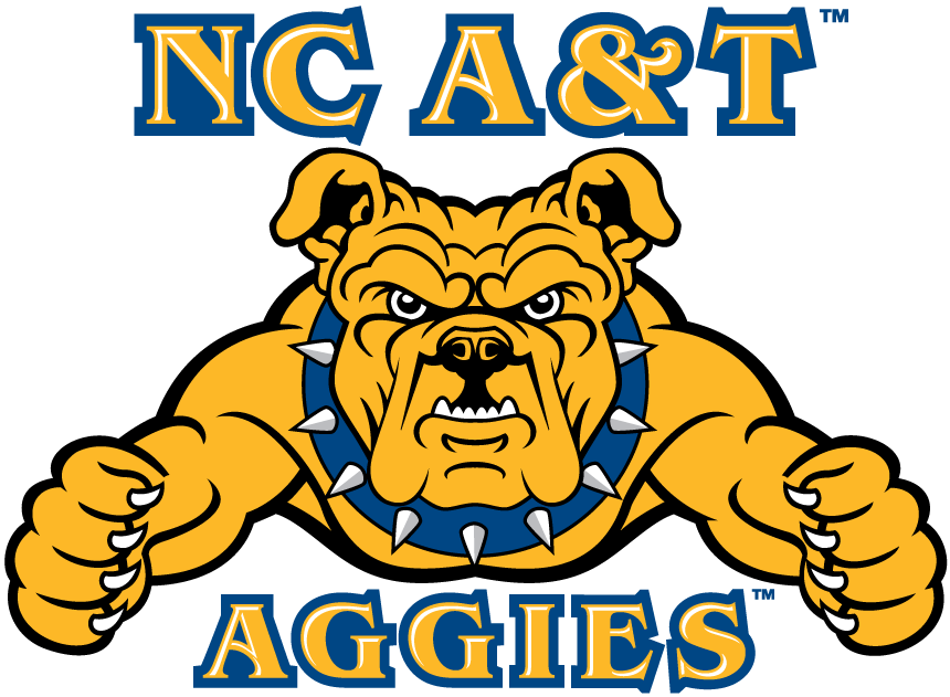  . Personally, I think now is the time for another upgrade and I think I would prefer a somewhat minimalist design with less lines and a stronger stroke (outline). Maybe something like this:  But with a fatter face, raised head, and maybe even wearing an oldschool cap with the Lock on it. |
|
|
|
Post by codeblu78 on Jan 13, 2018 11:21:51 GMT -5
When u da Big Dawg, u have Big Dawg Problems!
😉
|
|